
Exploring the results of the time correlation analysis
Before you begin
Procedure
What to do next
In the Graphics view, you can clear the check box of the value(s) you want to hide in the chart.
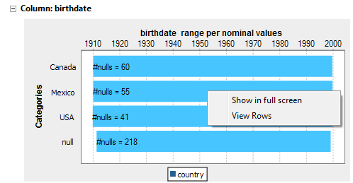
The Gantt chart displays a range showing the minimal and maximal birth dates for each country listed in the selected nominal column. It also highlights the range bars that contain null values for birth dates.
For example, in the above chart, the minimal birth date for Mexico is 1910 and the maximal is 2000. And of all the data records where the country is Mexico, 41 records have null value as birth date.
You can also select a specific birth date range to show if you put the pointer at the start nominal value you want to show and drag it to the end nominal value you want to show.
From the generated graphic, you can:
- Clear the check box of the values you want to hide in the chart.
- Hover over a range bar to display the correlated data values at that position.
- Right-click a range bar and select:
- Show in full screen to open the generated graphic in a full screen.
- View rows to access a list of all analyzed rows in the selected column.
The below figure illustrates an example of the SQL editor listing the correlated data values at the selected range bar.
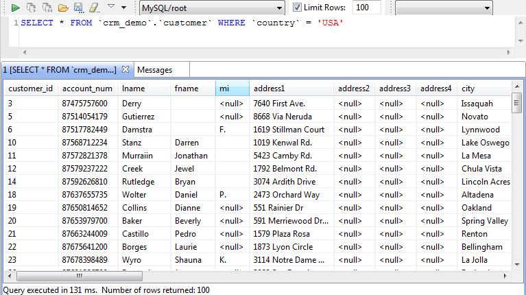
From the SQL editor, you can save the executed query and list it under the Libraries > Source Files folders in the DQ Repository tree view if you click the save icon on the editor toolbar. For more information, see Saving the queries executed on indicators.
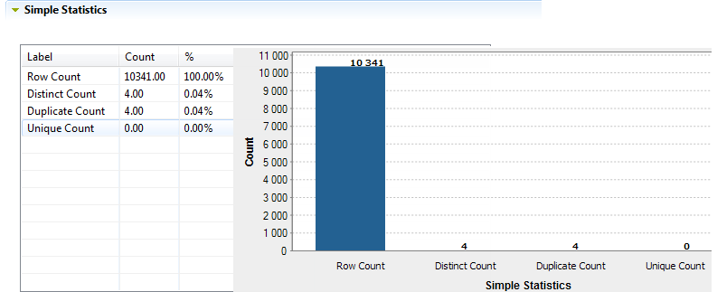
The Simple Statistics view shows the number of the analyzed records falling in certain categories, including the number of rows, the number of distinct and unique values and the number of duplicates.
The Data view displays the actual analyzed data.
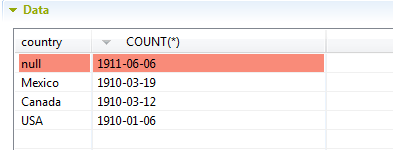
You can sort the data listed in the result table by simply clicking any column header in the table.
Did this page help you?
If you find any issues with this page or its content – a typo, a missing step, or a technical error – let us know how we can improve!