
Exploring the results of the nominal correlation analysis
Before you begin
In the Analysis Results view of the analysis editor:
Procedure
Results
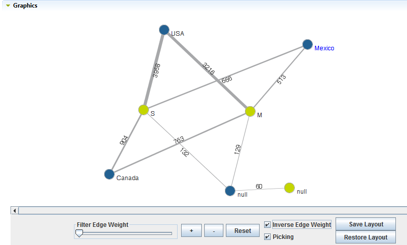
To have a better view of the graphical result of the nominal correlation analysis, right-click the graphic in the Graphics panel and select Show in full screen.
In the above chart, each value in the country and marital-status columns is represented by a node that has a given color. Nominal correlation analysis is carried out to see the relationship between the number of married or single people and the country they live in. Correlations are represented by lines. The thicker the line is, the higher the association is, if the Inverse Edge Weight check box is selected.
- Filter Edge Weight: move the slider to the right to (filter out edges with small weight) visualize the more important edges.
- plus and minus: click the [+] or [-] buttons to respectively zoom in and zoom out the chart size.
- Reset: click to put the chart back to its initial state.
- Inverse Edge Weight: by default, the thicker the line is, the weaker the correlation is. Select this check box to inverse the current edge weight, that is give larger edge thickness to higher correlation.
- Picking: select this check box to be able to pick any node and drag it to anywhere in the chart.
- Save Layout: click this button to save the chart layout.
- Restore Layout: click this button to restore the chart to its previously saved layout.
The Simple Statistics view shows the number of the analyzed records falling in certain categories, including the number of rows, the number of distinct and unique values and the number of duplicates.
The Data view displays the actual analyzed data.
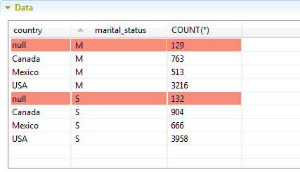
You can sort the data listed in the result table by simply clicking any column header in the table.
Did this page help you?
If you find any issues with this page or its content – a typo, a missing step, or a technical error – let us know how we can improve!