
Numerical correlation analyses
This type of analysis analyzes correlation between nominal and interval columns and gives the result in a kind of a bubble chart.
A bubble chart is created for each selected numeric column. In a bubble chart, each bubble represents a distinct record of the nominal column. For example, a nominal column called outlook with 3 distinct nominal instances: sunny (11 records), rainy (16 records) and overcast (4 records) will generate a bubble chart with 3 bubbles.
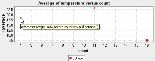
The second column in this example is the temperature column where temperature is in degrees Celsius. The analysis in this example will show the correlation between the outlook and the temperature columns and will give the result in a bubble chart. The vertical axis represents the average of the numeric column and the horizontal axis represents the number of records of each nominal instance. The average temperature would be 23.273 for the "sunny" instances, 7.5 for the "rainy" instances and 18.5 for the "overcast" instances.
The two things to pay attention to in such a chart is the position of the bubble and its size.
Usually, outlier bubbles must be further investigated. The more the bubble is near the left axis, the less confident we are in the average of the numeric column. For example, the overcast nominal instance here has only 4 records, hence the bubble is near the left axis. We cannot be confident in the average with only 4 records. When looking for data quality issues, these bubbles can indicate problematic values.
The bubbles near the top of the chart and those near the bottom of the chart may suggest data quality issues too. A too high or too low temperature in average can indicate a bad measure of the temperature.
The size of the bubble represents the number of null numeric values. The more there are null values in the interval column, the bigger will be the bubble.
When several nominal columns are selected, the order of the columns plays a crucial role in this analysis. A series of bubbles (with one color) is displayed for the average temperature and the weather. Another series of bubbles is displayed for the average temperature and each record of any other nominal column.
Did this page help you?
If you find any issues with this page or its content – a typo, a missing step, or a technical error – let us know how we can improve!