
Filtering values using charts
The Chart tab shows a graphical representation of your data. It is also a quick and easy way to apply filter on your data.
According to the type of data that you select, the type of graphical representation in the tab will be different:
- Vertical bar charts for numerical data
- Horizontal bar charts for text data
- US map for the two-letter US State codes
- World map for the two-letter country codes
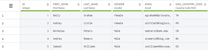
This example uses a dataset with typical customer information, such as their names, gender, email or the country they live in.
Procedure
-
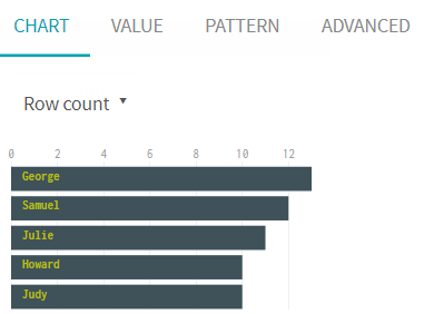
Select a column containing text data you want to filter,
FIRST_NAME for instance.
The horizontal bar chart showing the most common occurrences of first names is displayed in the chart tab.
-
Select the ISO2_COUNTRY_CODE column.
This time, the data is displayed in the form of a world map. The more occurrences of a country there is, the darkest this country will be on the map.
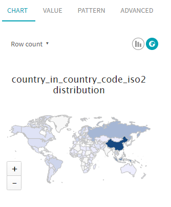
You can alternate between the world map view and the usual bar chart view by clicking the icons on the top right of the chart tab.
-
Click the Unites States directly on the map to add this filter to the previous
one.
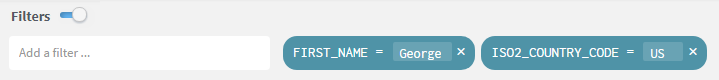
The grid now only displays the data corresponding to those two filters.
Did this page help you?
If you find any issues with this page or its content – a typo, a missing step, or a technical error – let us know how we can improve!