
Component usage pie chart
The components pie chart (pie-shaped chart) is used to give a quick overall visual impression of the audit results regarding proportions of each of the component types used in the audited project.
It is split into segments, illustrating percentages of components based on their types. It uses those percentages or fractions to compare component types used in the project. The whole is equal to 100%.
Below is an example of a pie chart for an audited project.
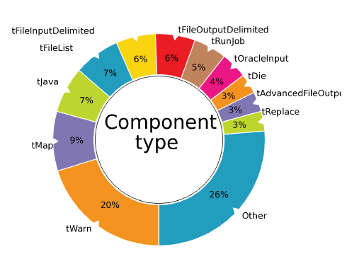
Information noteNote: All component types with less than 2.5% proportion will be grouped under
Other.
Did this page help you?
If you find any issues with this page or its content – a typo, a missing step, or a technical error – let us know how we can improve!