
Exploring the results of the numerical correlation analysis
Before you begin
Procedure
-
In the Analysis Results view of the analysis editor,
click Graphics, Simple Statistics
or Data to show the generated graphic, the number of the
analyzed records or the actual analyzed data respectively.
In the Graphics view, the data plotted in the bubble chart have different colors with the legend pointing out which color refers to which data.
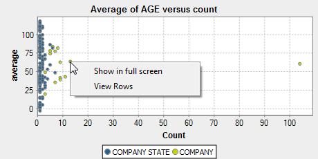
The more the bubble is near the left axis the less confident we are in the average of the numeric column. For the selected bubble in the above example, the company name is missing and there are only two data records, hence the bubble is near the left axis. We cannot be confident about age average with only two records. When looking for data quality issues, these bubbles can indicate problematic values.
The bubbles near the top of the chart and those near the bottom of the chart may suggest data quality issues too, too big or too small age average in the above example.
Results
From the SQL editor, you can save the executed query and list it under the folders in the DQ Repository tree view if you click the save icon on the editor toolbar. For more information, see Saving the queries executed on indicators.
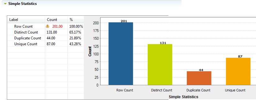
The Simple Statistics view shows the number of the analyzed records falling in certain categories, including the number of rows, the number of distinct and unique values and the number of duplicates.
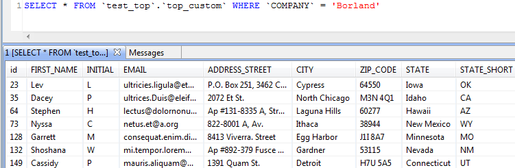
The Data view displays the actual analyzed data.
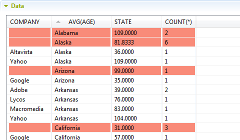
You can sort the data listed in the result table by simply clicking any column header in the table.
Did this page help you?
If you find any issues with this page or its content – a typo, a missing step, or a technical error – let us know how we can improve!